Okay. First an apology. I promise, cross my heart, that I will eventually set a table in my own home—rather than here in the shop! Next week—consider it DONE!
Second, I had decided to take pictures of our new Tuscan table—it’s actually more Tuscany meets Provence (I flatter myself)—but then realized I had a different idea for the setting, which morphed into a slightly different setting, which . . . well, you get the picture. Actually, you will get the pictures!
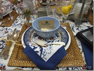
Below, I’ve added photos of the four options I conjured for this table. I’d like for you to choose the setting I should use. So, if you could leave a comment here—choosing the setting you like best—I will select a winner (using one of those random number generator thingees) for the prize prizes shown below:
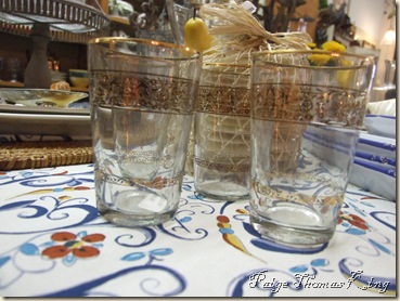
It’s a fishnet bag full of Capiz Shells from Two’s Company! These shells have a multitude of uses—only limited by your imagination. They are suitable for food use and look great with a mini grit cake topped with a grilled jumbo shrimp and pepper sauce! We’ve also used them as place cards or to label food items on a buffet table. Trust me—you’ll love them. I’ll also throw in four of these:
They’re Sahara tea glasses with hand worked gold leaf detailing.
So, here you go:
Tuscan Table Option 1
Tuscan Table Option 2
Tuscan Table Option 3
Tuscan Table Option 4
I know, I know—the changes are almost imperceptible, but if you participate in Tablescape Thursdays, you understand. I don’t need to explain further.
So, tell me what you think. Leave your comment and be entered to win the Capiz Shells and Sahara tea glasses. Be sure to tell your friends and other tablescape addicts—the more the merrier! I’ll be over to visit your post, too!
If you didn’t start here:
you need to go and take a look!
Thanks for your indulgence!


19 comments:
Wow, that was tough. I think I like option 4 best. The plates are so pretty, and I like that they can be seen better in that one.
I do like the little shell place-card holder in the first (and maybe third--I can't remember) option though. Those are great!
What a great looking Tuscan style table! I really love how you've tied the silverware together. Very nice touch. I personally would vote for number 1. No particular reason other than I like the way it looks the best. I look forward to seeing which one gets the most votes! Thanks for sharing and happy TT to you!
number 1 absolutely!!! the elements are gorgeous and so they are all pretty, but, the shell and napkin placement in #1 just does it for me!! aren't we silly!! have fun, donna
I like them all-but I will vote for #3. I think it would be neat to eat out of the shell! What beautiful tables-thanks for sharing with us.
I love Option number 2!
Claudia Samouce
These are all so pretty!
Donna
Beautiful!!! I love the tables, but my favorite is option #1. I love the shells, lemons, napkin placement and overall setting.If I lived closer I would definitely be a regular at your store!! Thanks for sharing your beautiful settings and store with us!
Susan
All are beautiful, but if I were forced to choose, it would be #3.
I LOVE LOVE LOVE pretty tables-an inherited thing from two grandmothers and an aunt. Vintage tablecloths, cloth napkins, and STERLING silver with real china and crystal...it just doesn't get any better!! I pick table number one-love the napkin placement and the pretty shell.
Wow, that was hard. I love how you changed up just little details but they all made a difference. I am voting for #1. There is just a bit of extra pop it that appeals to me. Those shells are amazing. Thanks for stopping by my blog.
Okay, I'm sensing a trend! I also like #1 the best. SO lovely! The linens, the dishes, the pop of yellow from the lemons? Wonderful!
Love the tablescapes! Hard to choose....I vote for option 1. Thanks for sharing.
I think I'll have to follow the trend to vote for option #1. It's nice and full, and all the elements seem perfectly in balance (I'm a Libra!).
Looking forward to seeing your "at home" table (eventually), but the shop is a great alternative!
Happy Tablescape Thursday!
Bill
Hi Paige,
Oh my, that's a tough decision to make. I am trying to decide between #2 and 3. I love the linens and like to see more of them. But I love the little bowl, too. Hmmmm, what to do.
At any rate, I'd love to win your giveaway, I am already planning what I'd do with those great prizes!!
Have a wonderful weekend, and thanks for visiting.
XO
Heidi - Heart and Home
Wow, all the options are so cute. Option 2 is my favorite. I really like those Capiz Shells, oh and that spoon too.
All the Best,
Requi
It's all so pretty. I'm glad that you told us what the first photo was -- I thought you got creative with a stack of tortillas!!!
It's a toss up between 2 & 3. I love the blue boarder of the napkin showing, but two is beautiful also.
My favorite is no.3. I like the lighter blue color of the bowl and also the brown of the Hodgepodge card ties the brown woven placemat into the setting. Also like the napkin on the plate with the spoon on it.
I, along with some of the others have to go with option #1. I love the symmetry of it, what a great look. The pearl-essence of the shell dish is amazing and I would love to have them on my table. I can't wait to see what you do next.
You have a great talent for tablescapes. jtlucas@msn.com
Post a Comment